180 countries. Hundreds of products and services. Thousands of designers and engineers.
At that scale, ensuring consistency in design is brutal, but vital.
Enter the Citi Design System (CDS) Team, which governs the design, development, and use of reusable design components. Things like Accordions, Dropdown Menus, and so on.
As the team's sole writer, I was responsible for writing guideline documentation for all of said components. Here, I've curated sections from two widely used components, demonstrating my approach to standardized guidelines for designers and developers across the globe.
See the full versions of these and other component guidelines I wrote:
Use the pill buttons to see guidelines
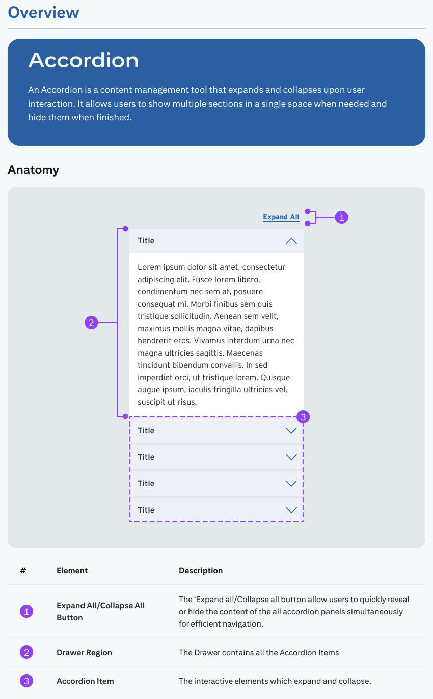
Rather than treating the Accordion as a purely visual component, I defined it as a content-management pattern with clear linguistic hierarchy.
Establishing this foundation early prevents misuse, reduces ambiguity, and ensures that expandable content behaves predictably across Citi’s global ecosystem.
Now, the nitty-gritty—where the guidelines start getting technical.
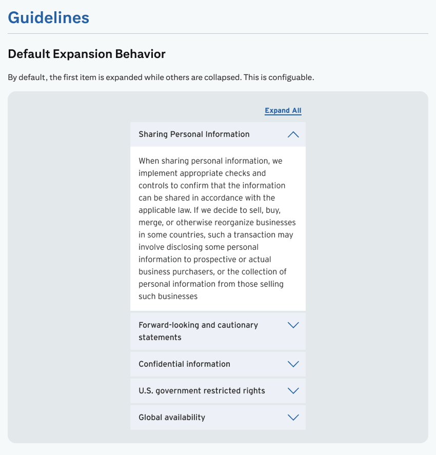
The CDS Team fielded constant questions about the Accordion from other design and development teams, especially regarding the default expansion behavior. My guidelines were a direct effort to alleviate that.
To be fair, important UX considerations went into defining expansion behavior. Opening the first Accordion on page load reveals some initial content, and also indicates the others can expanded at will.
My design partner and I created clear visual instructions for this behavior, which helped alleviate meetings with other design teams.
During in my time with CDS, Citi was hit with an eye-watering fine for noncompliance with several (ADA) requirements.
So, naturally, we added an "Accessibility" section to our design guides.
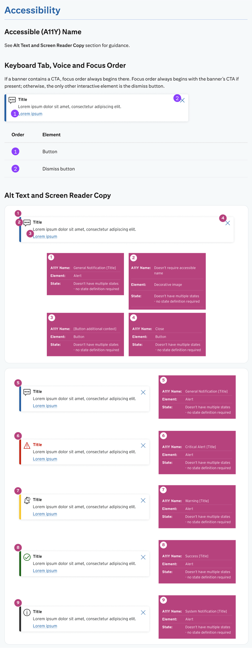
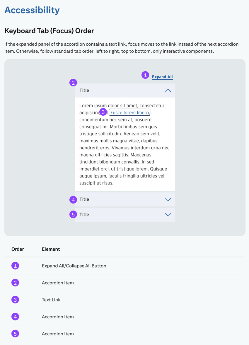
At a component level, accessibility involves two things: how assistive technologies announce interface elements (ARIA labels, semantic structure), and how users navigate interactive elements using the keyboard.
Because most of the content within this component is live text, I highlighted keyboard tab and focus order for non-visual and keyboard-only users.
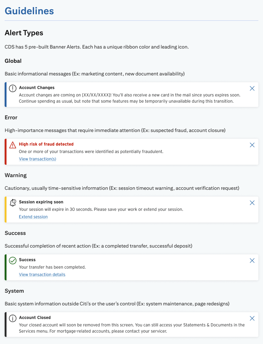
The Banner Alert is one of Citi's most technical components. Behind its simple layout is a complex set of rules governing its use; it comes in several variations, each using different colors, icons, and page placement to convey tone and urgency.
Confused? You're not alone. Citi's designers were, too, and they flooded the CDS team with questions about it. My task was to write guidelines salient enough to help alleviate those questions.
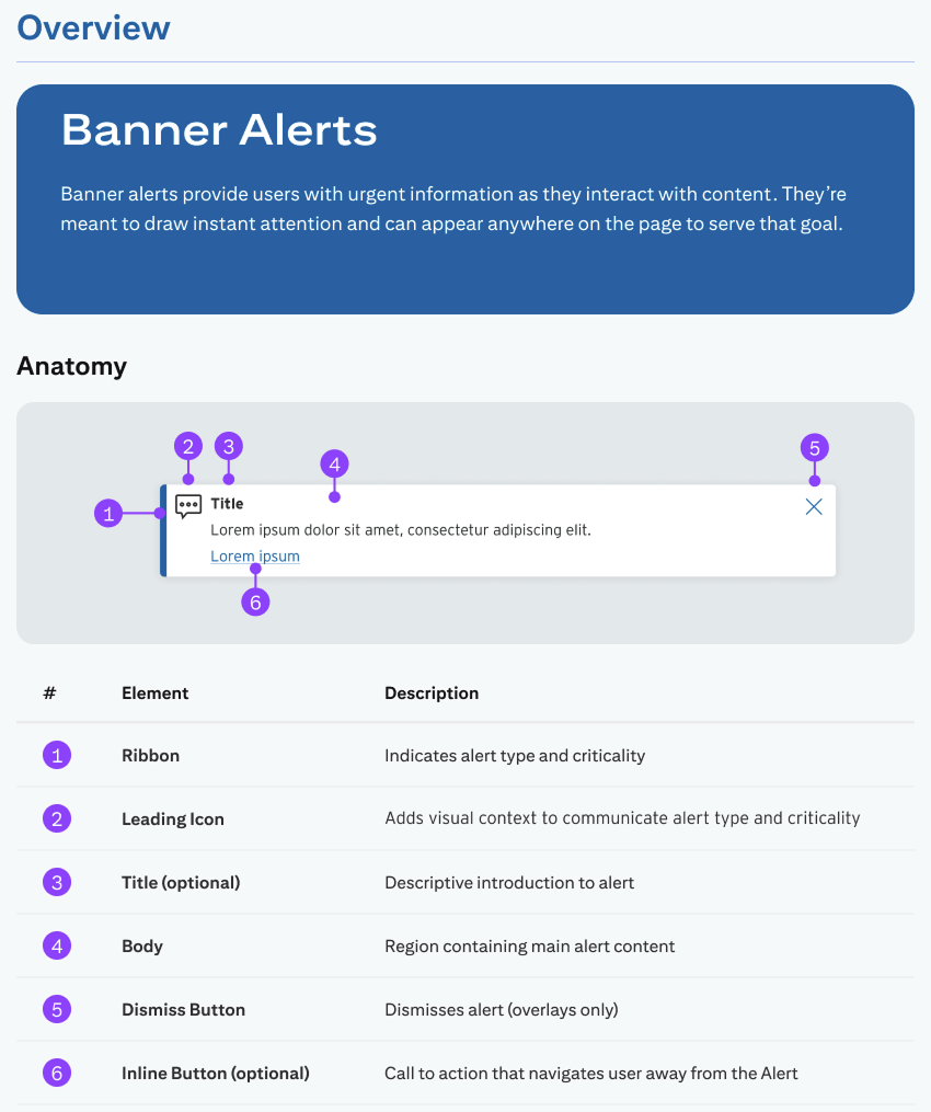
The first trick to writing usage guidelines for Banner Alerts was giving each variation a distinct (and succinct) name. This was a requirement from developers.
But they couldn't just be any names—they had to accurately describe the individual Banner types' content and use, which was a challenge given some seemingly trivial differences between them.
Take the "Warning"and "Global" types, for instance; our team pushed to combine them, but our developers correctly pointed out edge use cases making that impossible.
All this to say, I facilitated direct communication between our design team and developers to name and define each alert type.
Citi's Banner Alerts rely on color and iconography to convey message urgency, which is obviously unacceptable for non-visual users. This made defining and explaining the component's accessibility functionality one of the most challenging parts of the project.
I had to define a unique ARIA labeling system that would allow assistive technologies to:
Plus, since the Alerts support both dismissal buttons and CTAs, I had to design a custom focus order that allowed disabled users to select the CTA first, instead of dismissing the Alert before reading it.